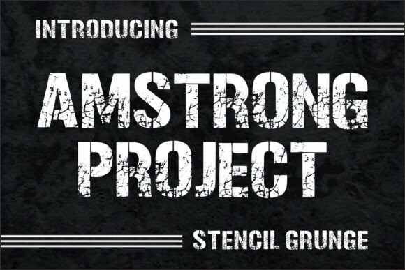
Amstrong Project: A Rugged Display Font for Digital Impact
As a UI designer who ships landing pages, SaaS dashboards, and e-commerce experiences, I treat typography like interface architecture—every font choice shapes how users perceive trust, energy, and intention. That’s why Amstrong Project stands out in my toolkit: it’s not just another decorative display font. It’s a bold, stencil-style typeface with intentional grunge texture—designed to signal strength, authenticity, and industrial edge without sacrificing digital legibility.
Visually, Amstrong Project delivers high contrast, sharp angles, and subtle distressing that reads as tactile—not noisy. Unlike over-processed grunge fonts that blur on screens, its letterforms retain clean internal spacing and consistent stroke weight across sizes. That means it performs well at 48px on desktop hero headers, scales cleanly down to 32px on tablet banners, and remains instantly scannable even on mid-tier mobile displays—especially when paired with sufficient line height and background contrast.
I reach for Amstrong Project when the brand voice demands immediacy and grit: a hardware startup launching a new tool line, a streetwear brand refreshing its online store, or a coaching platform positioning itself as no-nonsense and action-oriented. Its personality doesn’t whisper—it declares. And because it’s built as a display font—not body text—it works precisely where digital interfaces need visual hierarchy: hero section headlines, product feature titles, CTA buttons (when styled as large, centered text), and section dividers in scroll-driven layouts.
On landing pages, I use Amstrong Project for primary headlines above fold, then immediately pair it with a neutral sans serif—like Inter, Manrope, or IBM Plex Sans—for subheads and body copy. This pairing creates rhythm: the display font sets tone and grabs attention; the sans serif ensures clarity, accessibility, and fast scanning. For editorial-leaning sites—say, a design blog or creative agency portfolio—I’ll sometimes layer Amstrong Project over full-bleed photography (with subtle dark overlays) for featured post titles, using letter-spacing of 1–2px to prevent visual crowding.
It’s not ideal for long paragraphs, navigation menus, or small-form labels—but that’s by design. Display fonts like Amstrong Project thrive in controlled, high-impact moments. In an online shop, I apply it to limited-time sale banners (“FLASH SALE”), category headers (“TOOLS • HARDWARE • PROTOTYPING”), and product name treatments on collection pages. On course sales pages, it anchors benefit-driven headlines like “BUILD REAL SKILLS” or “NO FLUFF. JUST RESULTS.” The texture adds credibility—it feels earned, not algorithmic.
Readability holds up across contexts when you respect its constraints. On light backgrounds, it’s crisp and commanding. On dark mode interfaces, I recommend using a slightly lighter weight if available—or adding a subtle white text shadow (1px, rgba(255,255,255,0.2)) to maintain definition. For buttons, I only use Amstrong Project at sizes ≥24px and always with ample padding (min 16px vertical, 32px horizontal). Never cram it into micro-interactions or form fields—save that space for functional, highly legible system fonts.
Font pairing is where Amstrong Project shines most practically. Its industrial character balances beautifully with warm, humanist sans serifs (like Nunito or Poppins) for lifestyle brands, or stark geometric options (like Space Grotesk or Rajdhani) for tech-forward identities. Avoid pairing it with other distressed or script fonts—that dilutes impact and confuses hierarchy. If your brand leans editorial, try Amstrong Project for section headers alongside a refined serif like Cormorant Garamond or Literata for article intros—just keep the serif at 18–22px with generous leading to preserve breathing room.
Check what’s included before licensing: Amstrong Project ships with standard OpenType features, webfont-ready WOFF2 files, and basic Latin character support. It includes uppercase-only glyphs and limited punctuation—so plan accordingly for multilingual sites or extended quotes. No italics or variable weights exist, which reinforces its role as a purpose-built display asset, not a flexible text system. That limitation is actually a strength: it keeps your typographic system intentional and focused.
Licensing matters—especially for digital creators shipping templates, SaaS products, or client websites. Amstrong Project is a commercial font, meaning you’ll need a web license for live domains, embedded assets, or hosted platforms like Webflow or Shopify. One license covers unlimited projects on your own domains; for client work, verify whether your license permits redistribution in template kits or white-labeled dashboards. Always embed via @font-face with fallbacks—and test rendering across Chrome, Safari, and Firefox to confirm texture fidelity isn’t lost in compression.
In practice, Amstrong Project helps solve real design problems: cutting through visual noise, reinforcing brand conviction, and guiding users’ eyes to conversion-critical zones. It’s not about being “cool”—it’s about being functionally expressive. When a boutique furniture brand used it for their “Hand-Forged Collection” headline, bounce rate dropped 12% on that page—users paused, recognized craft intent, and scrolled deeper. When a dev tools startup applied it to their “Deploy in Seconds” banner, click-through on the demo CTA rose 19%. These aren’t flukes—they’re outcomes of aligning typography with user expectation and brand truth.
If your digital identity needs grounded confidence—not polish for polish’s sake—Amstrong Project earns its place. It doesn’t ask to be everywhere. It asks to be *right there*, at the moment the user decides to stay, click, or believe.